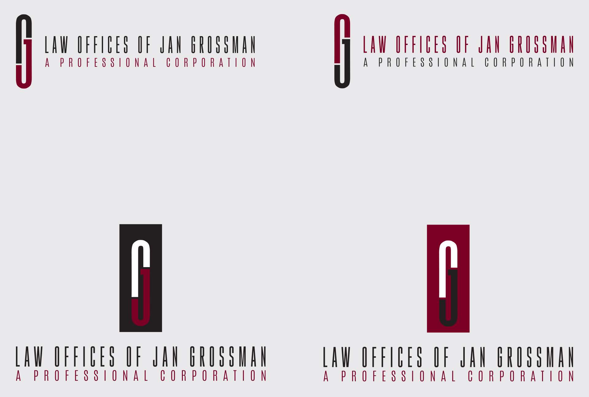
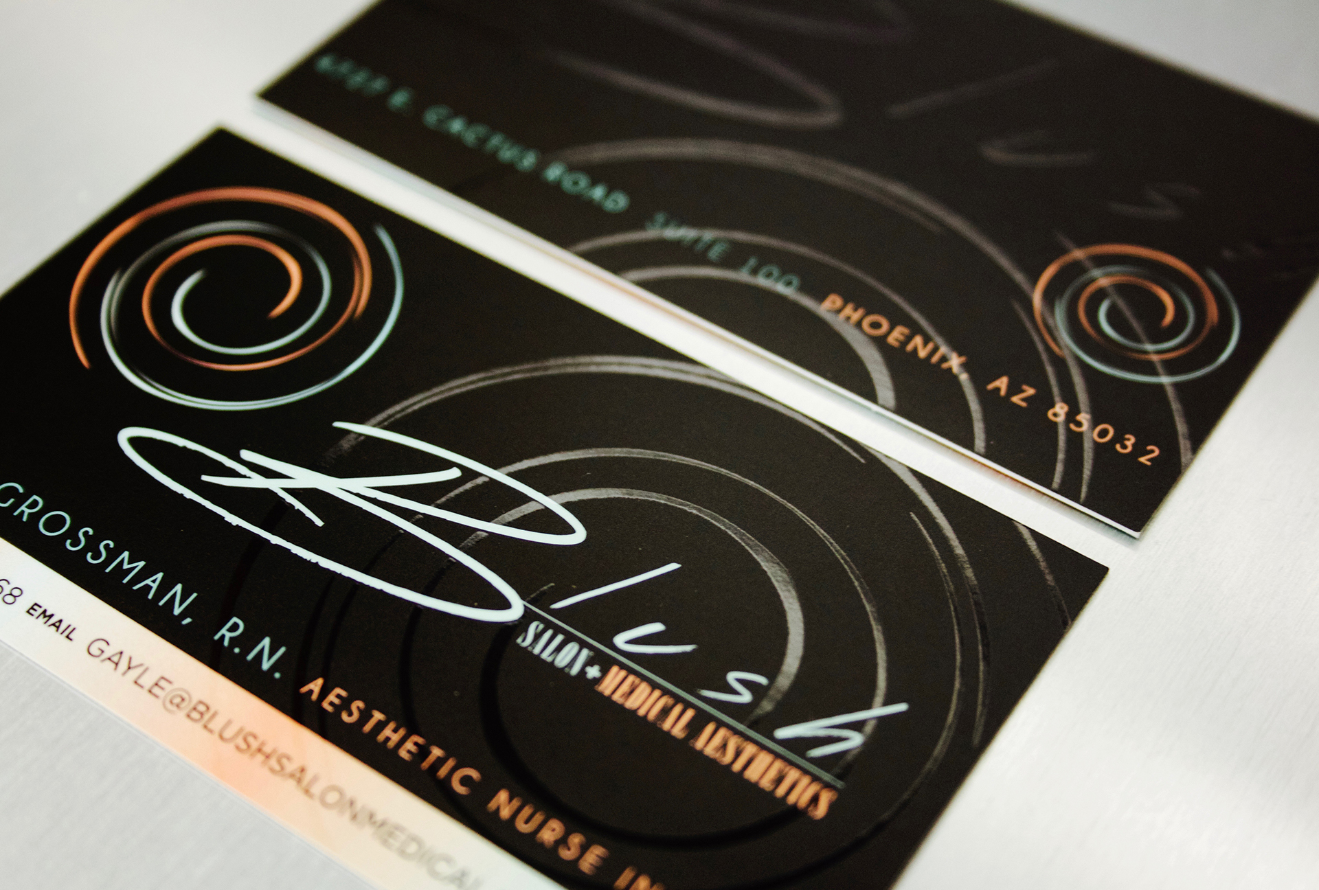
Blog Archives

JAN GROSSMAN LAW

This decorated attorney was in search of a smart, modernized revamp of his initials in the form of an emblem. Through our studies in form of the capital letter G, we discovered how two subtle breaks of negative space with a touch of color contrast brought enhanced definition to a JG form that doubles as a paperclip. A strong exhibition of simple style meeting strong substance.

CLIENT
Law Offices of Jan Grossman
PROJECT DATE

2016

CATEGORY

Branding Stationary

SHARE THIS

LIL’LETO CATERING

Authentic tastes of Italy & France converge within this one-of-a-kind Catering experience. Proudly donning the Flags (and colors of) France and Italy, we designed a typographic logo that used color and form to tantalize taste buds around town. Another seamlessly executed example of our Brand solutions applied to delivery vans, business cards and caterer uniforms.

CLIENT

Lil’ Leto Catering

PROJECT DATE

2012

CATEGORY

Branding Promotional

SHARE THIS

OBSIDIAN BUSINESS ADVISORS

Obsidian offers cutting-edge technologies that convert businesses into efficient, fully integrated machines. The Arrowhead, commonly composed of Obsidian, was developed to serve as Obsidian’s primary brand icon; multifaceted, strong, sharp & modern.

CLIENT

Obsidian Business Advisors

PROJECT DATE

2010

CATEGORY

Branding Stationary

SHARE THIS

SCULPTITUDE

A franchise of the trending & highly innovative, non-invasive fat freezing procedure, Coolsculpting, Sculptitude came to us in need of a Brand mark that stood above the rest in it’s highly competitive niche. We made the design decision to create an edgy, symmetrical S that doubled as the form of an hour glass and conveyed a faceted, chiseled physique. The creative direction proved synonymous with both female physiology and male fitness inspiring patients to “shine like cut diamonds”. The calming psychological effects of mint and teal color tones serve to remind patients of the virtually painless non-invasive procedure.

CLIENT

Sculptitude

PROJECT DATE

2015

CATEGORY

Branding Signage

SHARE THIS
VIEW PROJECT

BLUSH SALON

In the business of Beauty & Medical Aesthetics, a timeless artistic Identity speaks loudest. The spiral icon; symbolizing the circular form of the feminine “blush”. We used that same brush-stroked texture throughout the Blush typography and offset it with a complimentary Art-Deco typeface spelling out Salon + Medical Aesthetics. The pastel color scheme; stylishly in-line with shades of make-up, blush and mascara.

CLIENT

Blush Salon

PROJECT DATE

2014

CATEGORY

Branding Advertising

SHARE THIS
VIEW PROJECT

SWAY BOUTIQUE

Sway, an edgy women’s fashion boutique, came to us in need of a creative identity, store front signage and retail collateral. Our analysis of their garments and accessories was deemed elegant, whimsical, textured & flowing. We followed suit and created a Logo with high reproduction value to apply to signage, shopping bags, gift cards and window decals.

CLIENT

Sway Boutique

PROJECT DATE

2008

CATEGORY

Branding Signage

SHARE THIS
VIEW PROJECT

STATE 48 BREWERY

Surprise, Arizona based brewery, State 48, was in search of a brand that spoke to both the local Arizonan & Craft Beer Market. Using a creative arsenal of Brand elements that conveyed grungy retro vibes and celebrated the Grand Canyon State’s rugged, rich history was a must. We rolled out a Brand that was seamlessly and stylishly integrated into Building signage, beer labels, restaurant stationary, apparel and promotional items.

CLIENT

State 48 Brewery

PROJECT DATE

2014

CATEGORY

Branding Stationary

SHARE THIS

BARFLY LA JOLLA

Barfly Night Club’s Branding delivered an trendy, hip contrast to the upscale elegance of La Jolla Cove’s posh waterfront shops and restaurants. The result: a Brand that sticks and an establishment that stands out. Promotional materials, photography for celebrity appearances, event displays and liquor menus were designed in brand unison to leave lasting impressions on patrons.

Client

BARFLY

PROJECT DATE

2009

CATEGORY

Branding Promotional

SHARE THIS
VIEW PROJECT

CHARLES DELONG REALTY

As a young Realtor in the super competitive real estate market of Arizona, you have to brand BIG or go HOME. Charles DeLong consistently partners with us to build his brand recognition across platforms such as our premium business collateral, open house tear flags, poly-aluminum signage, mobile advertising & web design. This Realty Group’s Brand Presence & Marketing roll-out is seamless and second to none.

CLIENT

Charles Delong

PROJECT DATE

2014

CATEGORY

Branding Promotional

SHARE THIS

Privacy Settings
We use cookies to enhance your experience while using our website. If you are using our Services via a browser you can restrict, block or remove cookies through your web browser settings. We also use content and scripts from third parties that may use tracking technologies. You can selectively provide your consent below to allow such third party embeds. For complete information about the cookies we use, data we collect and how we process them, please check our Privacy Policy
Youtube
Consent to display content from - Youtube
Vimeo
Consent to display content from - Vimeo
Google Maps
Consent to display content from - Google