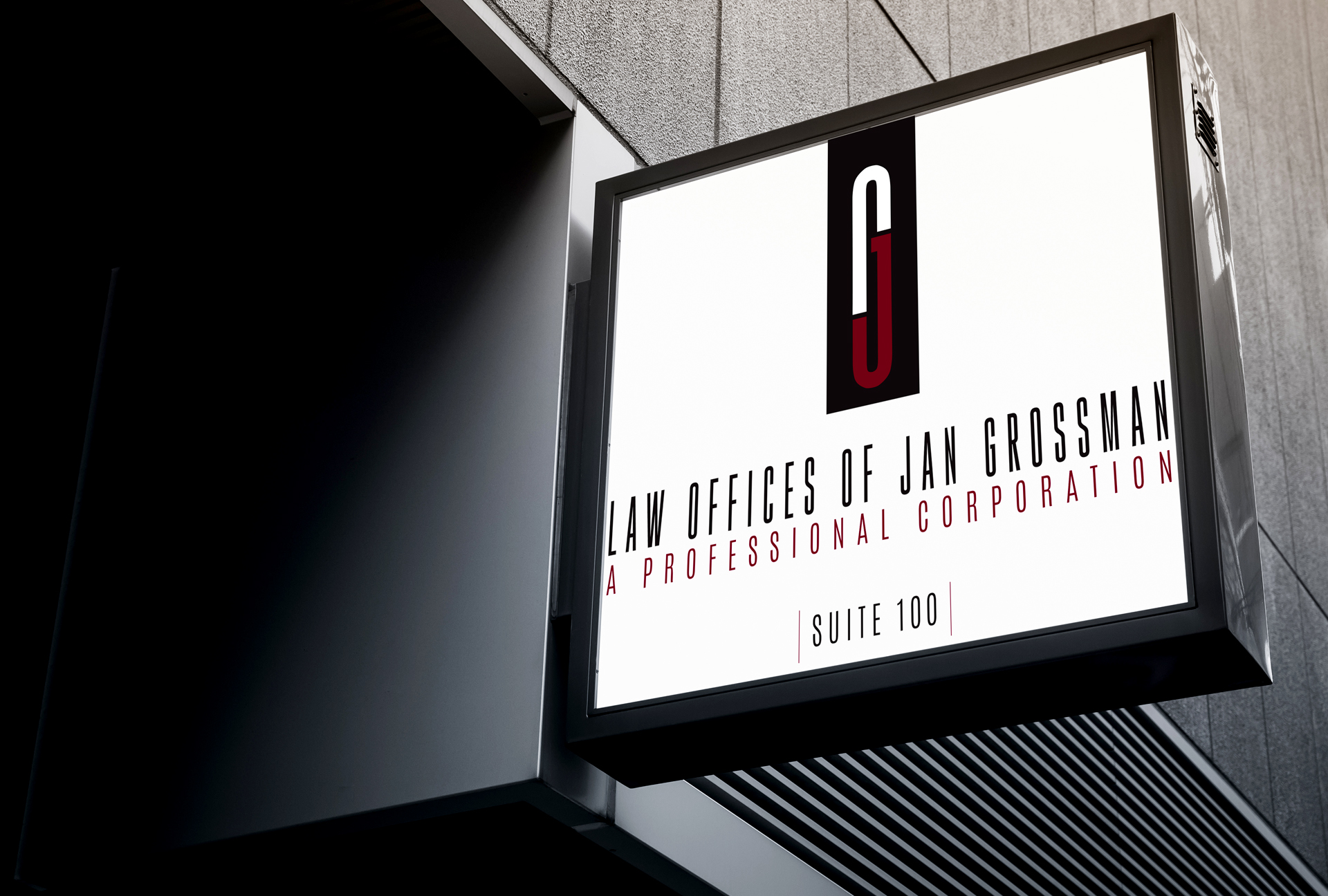
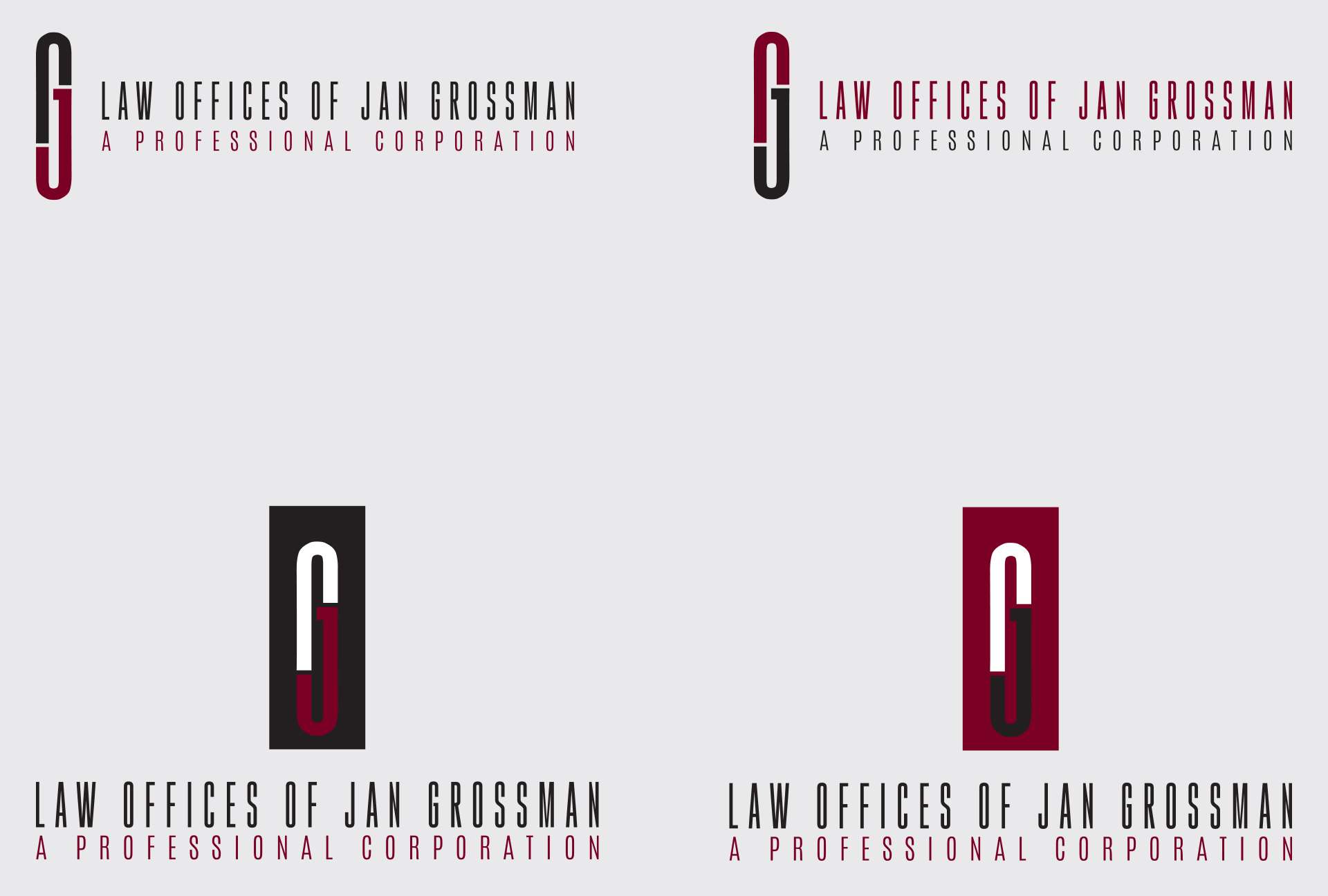
This decorated attorney was in search of a smart, modernized revamp of his initials in the form of an emblem. Through our studies in form of the capital letter G, we discovered how two subtle breaks of negative space with a touch of color contrast brought enhanced definition to a JG form that doubles as a paperclip. A strong exhibition of simple style meeting strong substance.

CLIENT
Law Offices of Jan Grossman
PROJECT DATE

2016

CATEGORY

Branding Stationary

SHARE THIS
Privacy Settings
We use cookies to enhance your experience while using our website. If you are using our Services via a browser you can restrict, block or remove cookies through your web browser settings. We also use content and scripts from third parties that may use tracking technologies. You can selectively provide your consent below to allow such third party embeds. For complete information about the cookies we use, data we collect and how we process them, please check our Privacy Policy
Youtube
Consent to display content from - Youtube
Vimeo
Consent to display content from - Vimeo
Google Maps
Consent to display content from - Google